Email has the highest return on investment of any other marketing channel. On average, email earns you $40 for every $1 spent. And the best part is that email is an owned channel, which means you can reach your subscriber directly instead of relying on social media algorithms to surface your content.
At Demand Curve, we’ve worked with over 500 startups, meticulously documenting growth tactics for all growth channels. We also incorporate what we’ve learned from our agency, Bell Curve, which works with Outschool, Imperfect Produce and Microsoft to name a few.
To understand how to use email marketing effectively, we interviewed email marketers at this year’s fastest-growing startups. This post covers the most profitable tactics they use that capture 80% of the value using 20% of the effort.
If people don’t open it, nothing else matters
The subject line of your email is the most important, yet most marketers neglect it until after crafting the body of the email.
The subject line of your email is the most important, yet most marketers neglect it until after crafting the body of the email.
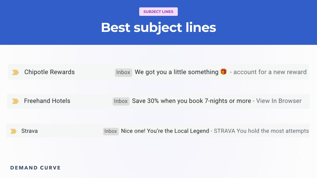
Increase the open-rate of your subject lines by making them self-evident. You don’t want people guessing why you want them to pay attention to your email. If the subject line is unclear or vague, your subscribers will ignore it.
One trick is to write like you speak. Try using subject lines that use informal language and contractions (it’s, they’re, you’ll). Not only will this save character count, it will also make your copy more friendly and quick to read.
Subject lines should be relevant to your subaudiences. Marketers generate 760% more revenue from segmented email campaigns than from untargeted emails.

A good subject line will increase the chances of your email being read. Image Credits: Demand Curve
If you’re collecting emails from multiple areas on your website, chances are the context will be slightly different for each. For example, people who subscribe after reading an article on ketogenic diets should receive emails that further educate them on keto and seeds products relevant to that lifestyle. Sending them information and product recommendations for vegetarians would not be relevant and could lead to them unsubscribing.
To ensure you’re sending relevant emails to the right audiences, segment your audience using tags and filters within your email marketing platform. Each platform will do this slightly differently, but all modern platforms should allow you to do this. When crafting your email subject line, ask yourself: “Would this email make sense to receive for this segment of subscriber?”
Your subject lines should be short and concise. About 46% of all emails are opened on mobile devices, which means the subject line must be short enough to fit on a smaller screen while getting your point across. Fifty characters is approximately the maximum length a subject line can be before it gets cut off on a mobile screen.
Founders, help TechCrunch find the best growth marketers for startups.
Provide a recommendation in this quick survey and we’ll share the results with everybody.
Keeping your subject lines short also makes them easier to scan when your subscriber is looking through their inbox. Including emojis in your subject line can cut down your character count and emulates how friends send text messages to each other. Including emojis in your subject lines will make your email feel less corporate and more friendly.
Designing emails that get read
Once your subscriber opens your email, there are three outcomes that can follow: read, skim or bounce.
Subscribers that read your emails are the most valuable, because they will consume the full contents of your email. Skimmers will only read the headlines and look at the images you include. Subscribers who bounce will open your email, but if nothing catches their attention right away, they will simply delete or close your email.
You’re going to want to design your emails to minimize the number of bouncers, satisfy readers and provide enough high-level information that skimmers still understand your message.
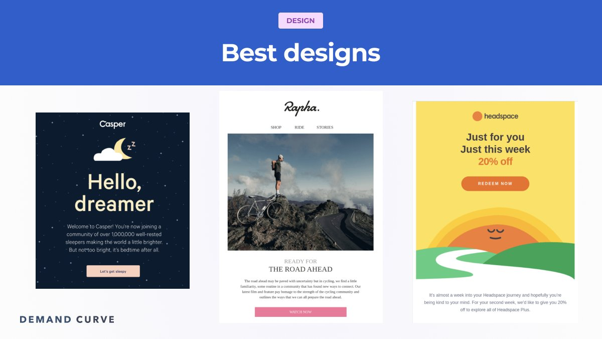
To minimize the number of bounces, choose an email design that catches the eye and is relevant to your brand. Take the Casper email below for example. The starry night background and moon illustration is directly relevant to the mattresses they sell. Visually branded email designs will help elevate your brand perception.

Design your emails to appeal to all kinds of readers. Image Credits: Demand Curve
To optimize for skimmers, write action-focused headlines. Use designs that draw the eye of your reader to key elements. As you can see in the Headspace example, the image of the rising sun pushes your gaze upward to the headline and the call-to-action button. Skimmers should be able to understand the context of the entire email and take action without needing to read the body.
To convert more readers, fulfill the expectation set by the subject line. Readers will be looking for any promises or hints you gave them in your subject line. Be sure to deliver on this promise in the body. Do so in an aggressively concise way — just because they’re reading doesn’t mean they don’t value their time.
Call to actions that convert
The goal of your body copy is to drive people to your call-to-action button (CTA). Your CTA is crucial, because it’s how you convert an email subscriber into a paying customer. To increase the conversion of your CTA, make a valuable promise in your body copy and headers that’s only delivered through your CTA.
Good CTA copy typically begins with a verb that teases what the reader will encounter next:
- Get your free sample.
- Redeem discount now.
- Browse the full inventory.
Low-converting CTA copy is vague or nonactive:
- Learn more.
- See inventory.
- Download.
Your email should only have one CTA. Any more and your conversion will decrease due to unnecessary decision-making. Ensure that the page on your site that your CTA leads to fulfills the promise you made in your body and CTA button.
Recap
Once the focus of the subject line is clear and the desired outcome is chosen, everything else should be crafted to carry the reader step by step through the email, eventually taking them to the desired action.
It’s a good idea to work backward from the desired outcome you want the reader to perform. If the desired outcome is for them to click on a CTA button, frame your subject line, headers and body copy as a valuable promise that can only be achieved by clicking the button.
Consider the experience of your email through the eyes of all three types of subscribers: readers, skimmers and bouncers. Use visual and written prompts that make the purpose of your email clear to all three categories. Failing to do so could lead to unsubscribes and lost revenue.
Email has the highest return on investment than any other marketing channel because you have a captive audience who has opted-in to you communicating with them. Email can drive six times more conversions that a Twitter post and is 40 times more likely to get noticed than a Facebook post.
Comments
Post a Comment