When it comes to smartwatches, it’s Apple against the world. It’s not that there aren’t plenty of other products to choose from — it’s more that the company has just utterly dominated the space to such a point that any other device is relegated to the realm of “Apple Watch alternatives.”
The company has been successful in the space for the usual Apple reasons: premium hardware with deeply integrated software, third-party support, a large cross-device ecosystem play and, of, course, simplicity. Taken as a whole, the Watch just works, right out of the box.
Five years after launch, the line is fairly mature. As such, it’s no surprise, really, that recent updates have largely amounted to refinements. As with most updates, the watch has gotten a processor boost up to the A14 processor, which the company claims is 20% faster than the last version. Perhaps the biggest hardware upgrade, however, is the addition of a blood oxygen sensor, an important piece in the company’s quest to offer as complete an image of wearer health as is possible from the wrist.
I wrote a pretty lengthy piece about the watch last week after wearing it for a few days. As I mentioned at the time, it was an odd kind of writeup, somewhere between hands-on and review. A week or so later, however, I’m more comfortable calling this a review — even if not too many of my initial impressions have changed much in the past several days. After all, a mature product largely means most of the foundations remain unchanged.
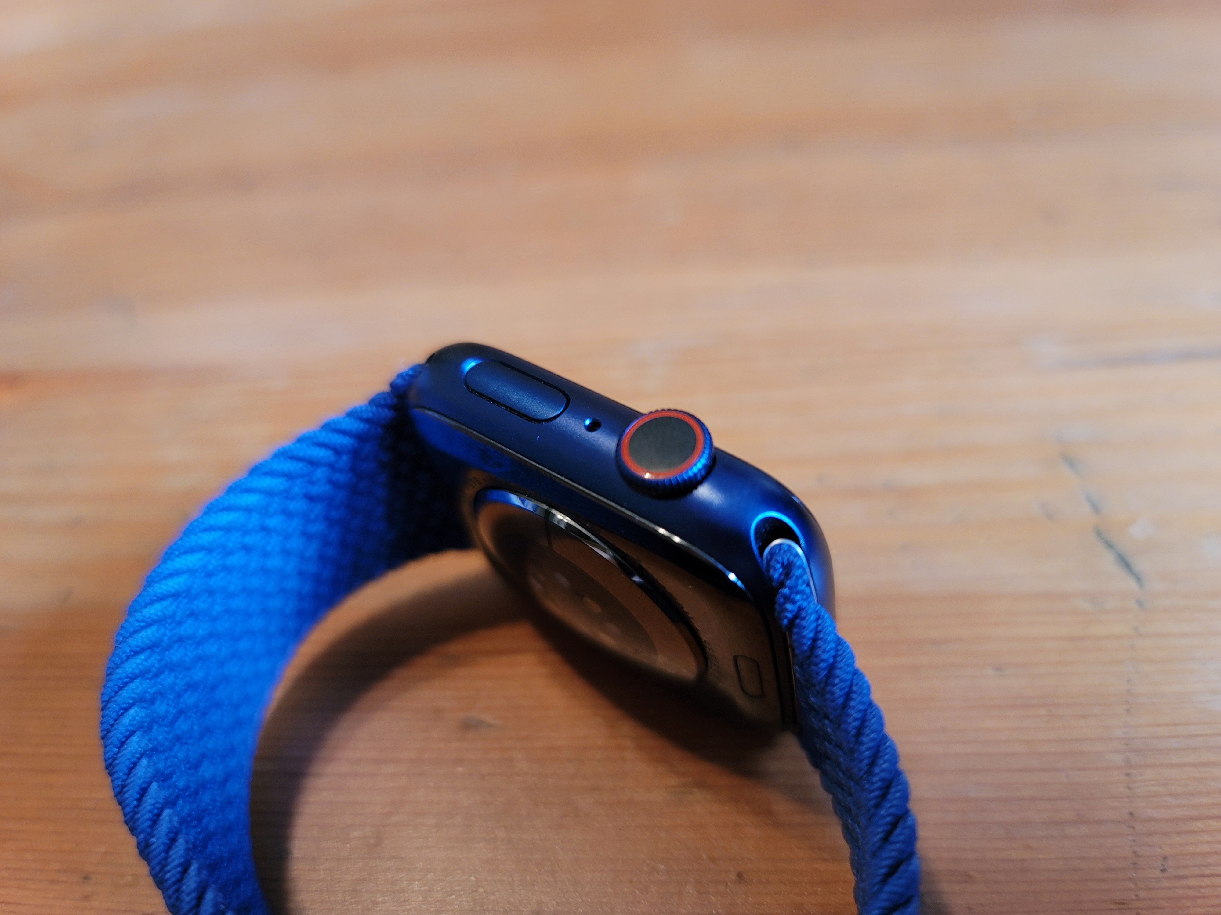
The Series 6 certainly looks the part. The Watch is tough to distinguish from other recent models — and for that matter, the new and significantly cheaper SE. The biggest visual change is the addition of new colors. In addition to the standard Gray and Gold, Apple’s added new Blue and (Product)Red cases. The latter seems to be the more ostentatious of the pair. The company sent me a blue model, and honestly, it’s a lot more subtle than I expected. It’s more of a deep blue hue, really, that reads more as black a lot of the time.
It’s tough to imagine the product undergoing any sort of radical rethink of the device’s design language at this point. We may see slight tweaks, including larger screen area going forward, but on the whole, Apple is very much committed to a form factor that has worked very well for it. I will probably always prefer Samsung’s spinning bezel as a quick way to interface with the operating system, but the crown does the job well and scrolling through menus even feels a bit zippier this time, perhaps owing to that faster silicon.
The new Solo Loop bands hit a bit of a hiccup out of the gate. I’ve detailed that a bit more here, but I suspect that much of the problem came down to the difficulty of selling a specifically sized product during a strange period in history where in-person try-ons aren’t really an option. In other words, just really bad timing on that front.
Personally, I quite like the braided model. I’ve been using it as my day to day band. It’s nice and blends in a lot better than the silicone model (I’ve frankly never been much of a fan of Apple’s silicone bands). But I do need to mention that Apple sent me a couple different sizes, which made it much easier to find the right fit. I recognize that. Especially when the braided Solo Loop costs a fairly exorbitant $99. The silicone version is significantly cheaper at $49, but either way, you’re not getting off cheap there. So you definitely want to make sure you get the right fit.

Image Credits: Brian Heater
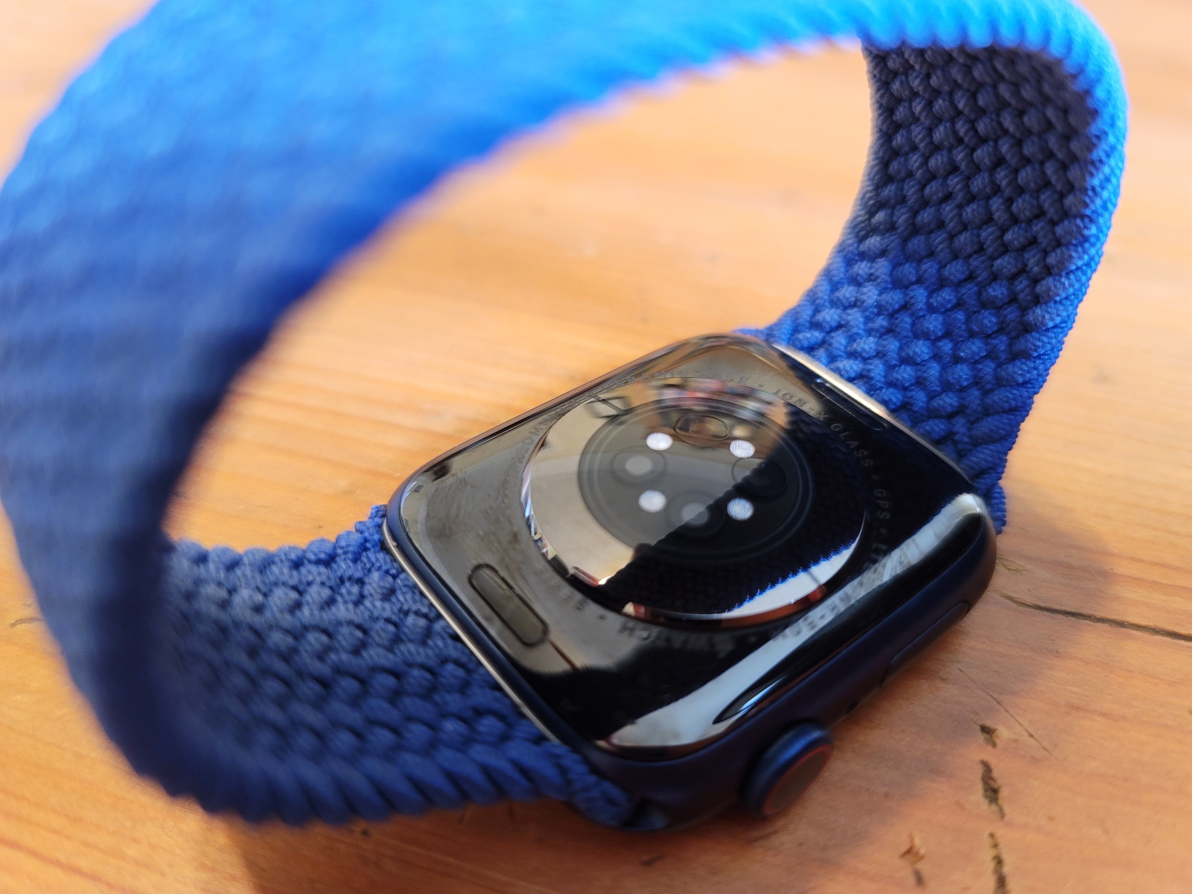
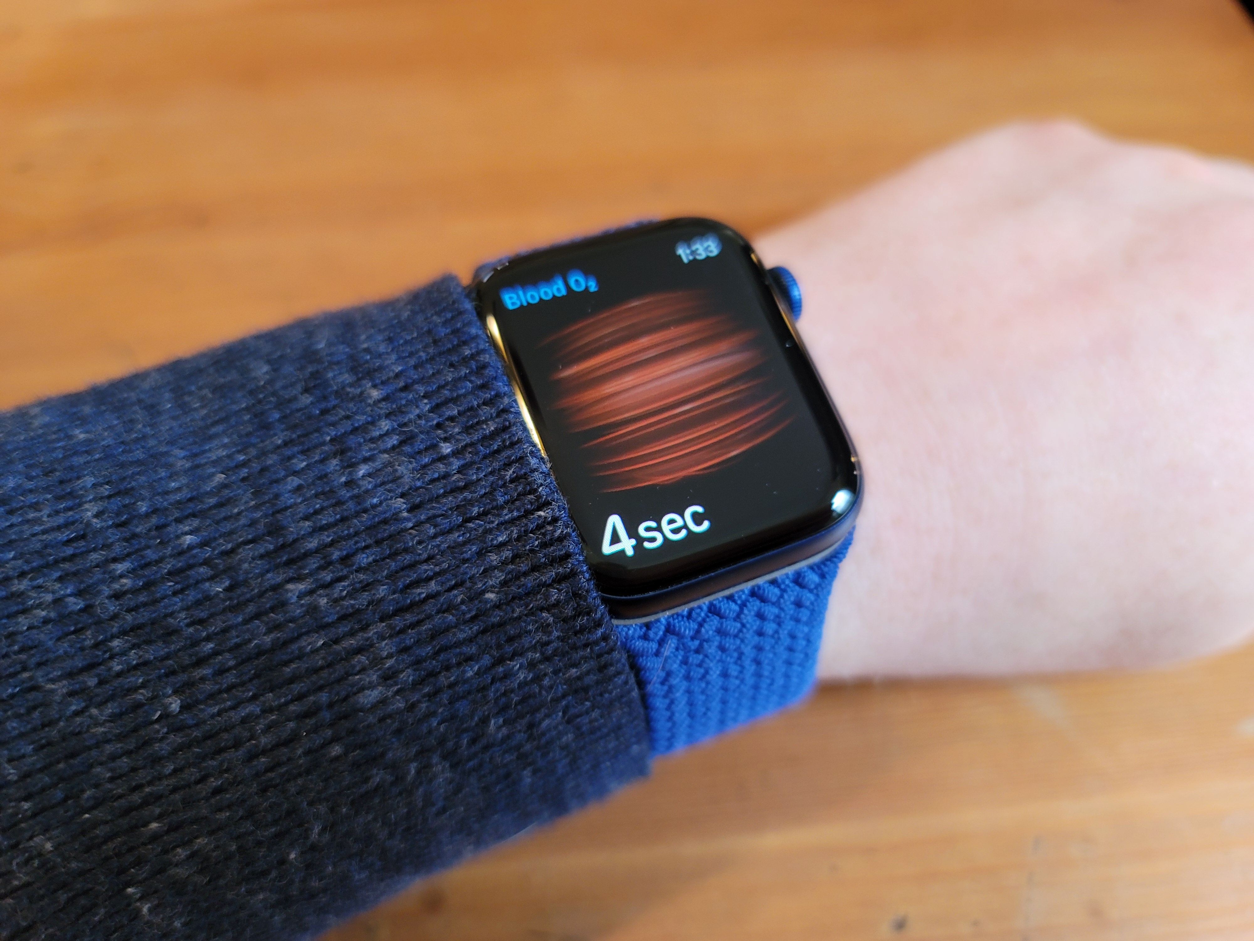
This is doubly important given the fact that the Series 6’s biggest new feature — blood oxygen monitoring — is highly dependent on you getting a good fit. The sensor utilizes a series of LEDs on the bottom of the watch to shine infrared and red light through the wearer’s skin and into their blood vessels. The color of light that reflects back gives the watch a picture of the oxygen levels in the blood. The whole thing takes about 15 seconds, but only works if your fit is right. Even with the right Solo Loop on, I found myself having to retake it a few times when I first started wearing the watch.
Beyond the on-demand measurements, the watch will also take readings throughout the day and night, mapping these trends over time and incorporating them into sleep readings. The overall readings will give you a good picture of your numbers over time. Honestly though, I get the sense that this is really just the tip of the iceberg of future functionality.
For now, there’s really no specific guidance — or context — given as far as what the numbers mean. Mine are generally between 90-100%. The Mayo Clinic tells me that’s good, but obviously there are a lot of different factors and variations that can’t properly be contextualized in a single paragraph — or on a watch. And Apple certainly doesn’t want to be accused of attempting to diagnose a condition or offer specific medical guidance. That’s going to be an increasingly difficult line for the company to walk as it gets more serious about these sorts of health tools.
If I had to venture a guess, I would say that the combination of sleep tracking in watchOS 7 and the on-board oximeter opens the door pretty nicely for something like sleep apnea tracking (again, more focused on alerts of irregularity versus diagnosis). We’ve seen a small handful of companies like Withings tackle this, so it seems like a no-brainer for Apple, pending all of the regulatory requirements, et al. There are all sorts of other conditions that blood oxygen levels could potentially alert the wearer to, if not actually diagnose.
Sleep was probably the biggest addition with the latest version of watchOS. This was probably the biggest blind spot for the line, compared to the competition. At the moment, the sleep tracking is, admittedly, still pretty basic. Like much of the rest of the on-board tracking, it’s mostly compared with changes over time. The metrics include time in bed versus time asleep, as well as incorporating heart rate figures from the sensor’s regular check-ins. More specific breakdowns, including deep versus light versus REM sleep haven’t arrived yet, but will no doubt be coming sooner than later.

Image Credits: Brian Heater
The door is also wide open for Apple to really get mindfulness right. The company has incorporated a mindfulness reminder for a while now, but it’s easy to imagine how the addition of various sensors like heart rate could really improve the picture and find the company going all-in on meditation, et al. The company could partner with a big meditation name — or, more likely, disrupt things with its own offering. The forthcoming Fitness+ offering could play an important role in the growth of that category, as well.
The other issue that sleep brings to the front is battery life. I was banking on the company making big strides in the battery department — after all, a big part of sleep tracking is ensuring that you’ve got enough charge to get through the night. Apple really only briefly touched on battery — though a recent teardown has revealed some smallish improvements on battery capacity (perhaps owing, in part, to space freed up by the dropping of Force Touch).
The company has also made some improvements to energy efficiency, courtesy of the new silicon. Official literature puts it at a “full-day” of battery life, up to 18 hours. I found I was able to get through a full day with juice to spare. That’s good, but the company’s still got some ground to make up on that front, compared to, say, the Fitbit Sense, which is capable of getting nearly a week on a charge. I think at this point, it’s fair to hold wearables to higher standards of battery life than, say, handsets. More than once, I’ve found myself intermittently charging the device — 20 minutes here and 20 minutes there — in order to have enough juice left by bedtime.
If you can spare more time than that, you should be able to get up to 80% in an hour or 100% in an hour and a half, courtesy of faster wireless charging. All told, the company has been able to shave significant time off of charging — a definite plus now that you’re not just leaving it overnight to charge. The latest version of watchOS will also handily let you know before if you don’t have enough charge to make it through a full night.
Other updates include the addition of the always-on Altimeter, which, along with the brighter screen doesn’t appear to have had a major impact on the battery. I’ll be honest, being stuck in the city for these last several months hasn’t given me much reason to need real-time elevation stats. Though the feature is a nice step toward taking the Watch a bit more seriously as an outdoor accessory in a realm that has largely been dominated by the likes of Garmin.

Image Credits: Brian Heater
Of course, the company now has three watches on the market — including the Series 3, which just keeps on ticking, and the lower-cost SE. The latter retains the design of the Series 6, but drops a number of the key sensors, which honestly should be perfectly sufficient for many users — and $170 cheaper than the 6’s $399 starting price ($499 with cellular).
Taken as a whole, the Series 6 isn’t a huge leap forward over the Series 5 — and not really worth the upgrade for those who already own that recent vintage. But there are nice improvements throughout, augmented by good upgrades to watchOS that make the best-selling smartwatch that much better, while clearly laying the groundwork for Apple Watches of the future.

Comments
Post a Comment